Home loan made easy


Role
UX Designer
Company
People's Choice
Type
Research, Service design, Customer experience, UI
Impact
Improved home loan application flow
People’s Choice is one of Australia’s largest credit unions, offering loans, credit cards, transaction and savings accounts, and insurance. Home loans are its primary product, and transforming lending operations with a modern, member-centric digital platform was essential for competitiveness and growth.
The old loan origination relied on multiple systems, manual inputs, and disconnected processes across staff and third parties. Digital transformation was the trigger to redesign the end-to-end loan lifecycle, improve processes, and deliver a better staff and customer experience.
Challenge
The old loan system relied on too many tools, manual steps, and rekeyed data—slowing down approvals and frustrating staff.
Our challenge was two-fold:
Cut loan processing time through automation and system consolidation
Boost conversions by speeding up the path from application to approval
My role
I worked as a UX Designer across the full cycle, collaborating with PMs, QA testers, analysts, and developers. My contributions included:
Requirements gathering and workflow mapping
Wireframing and prototyping solutions
Running usability testing and synthesising feedback
Designing UI and interactions for a consistent experience
Collaborating with marketing on content and messaging
Supporting developers to ensure responsiveness and product quality
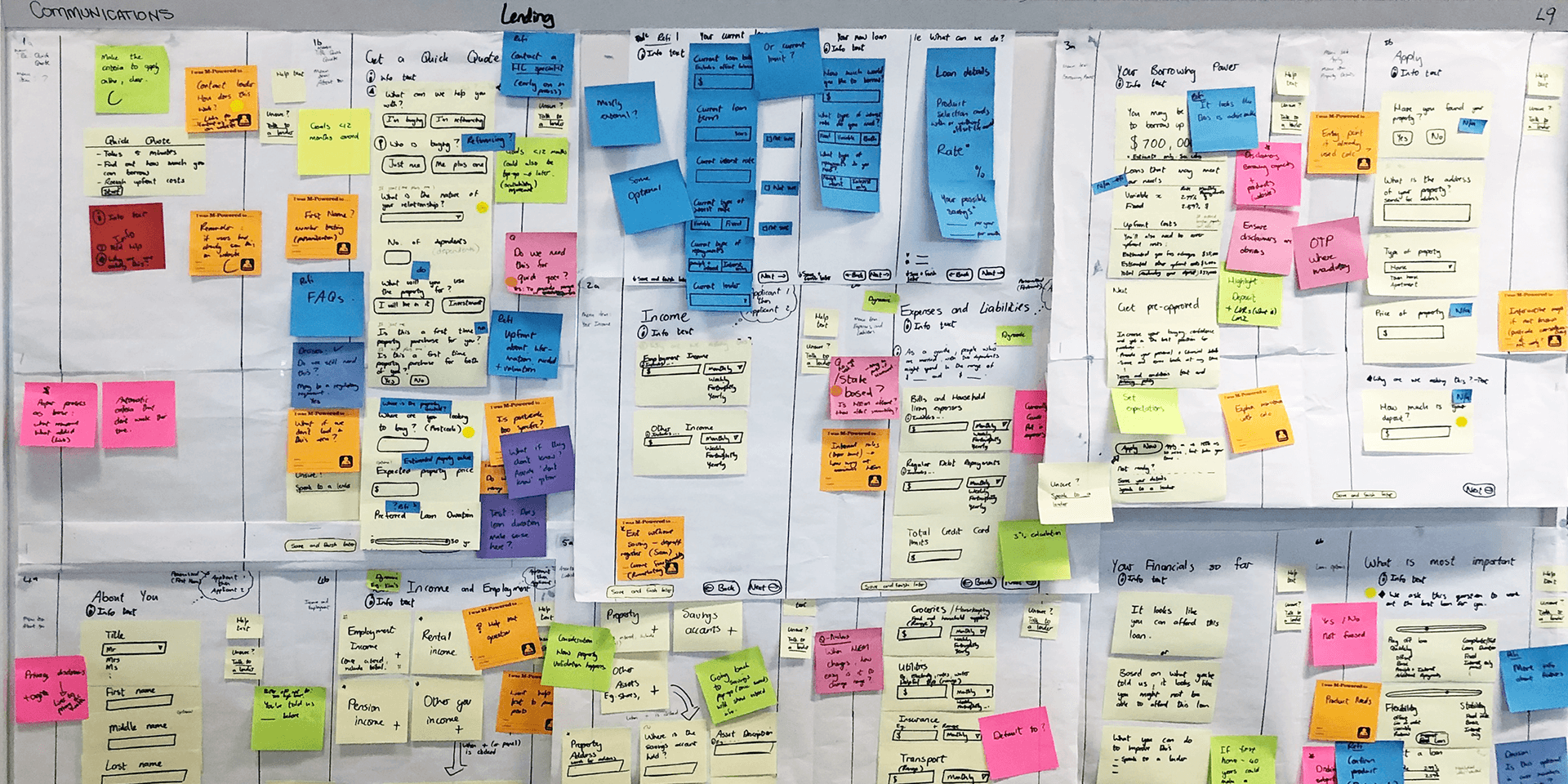
Research approach
We ran workshops with staff and interviewed members to unpack their experience—from initial application to final approval. This helped map the real journey, highlight bottlenecks, and design a smarter future state.
Clunky systems with poor integration, forcing staff to re-enter the same info
No way to use existing member data to personalise or fast-track applications
Errors in loan docs due to missing validation
Low application completion rates and slow turnaround
Disjointed channels: call centre staff couldn’t pick up where a member left off online
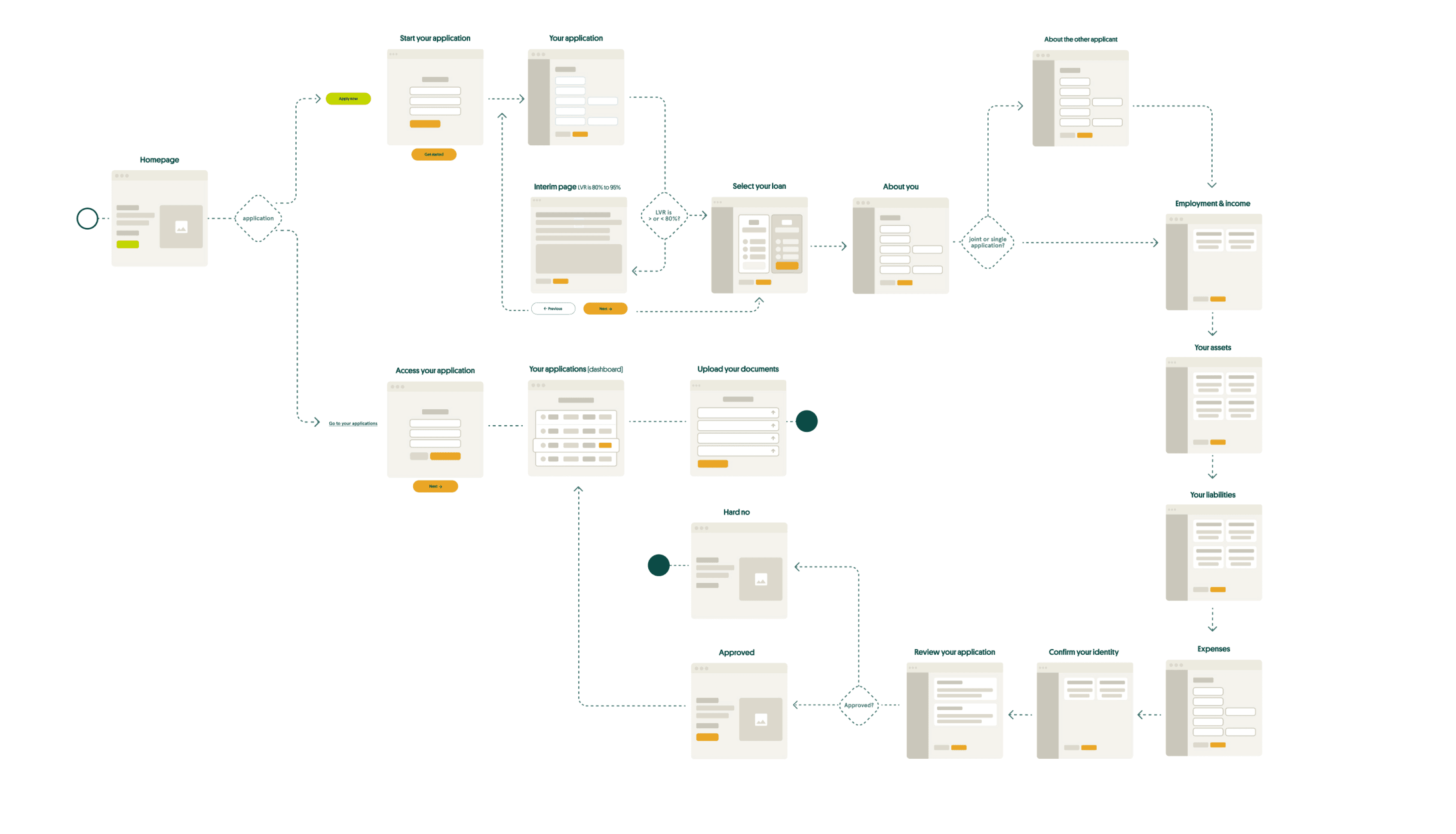
Design exploration
We created wireframes focused on the “verify” flow and tested feasibility with vendors before moving into high-fidelity design.
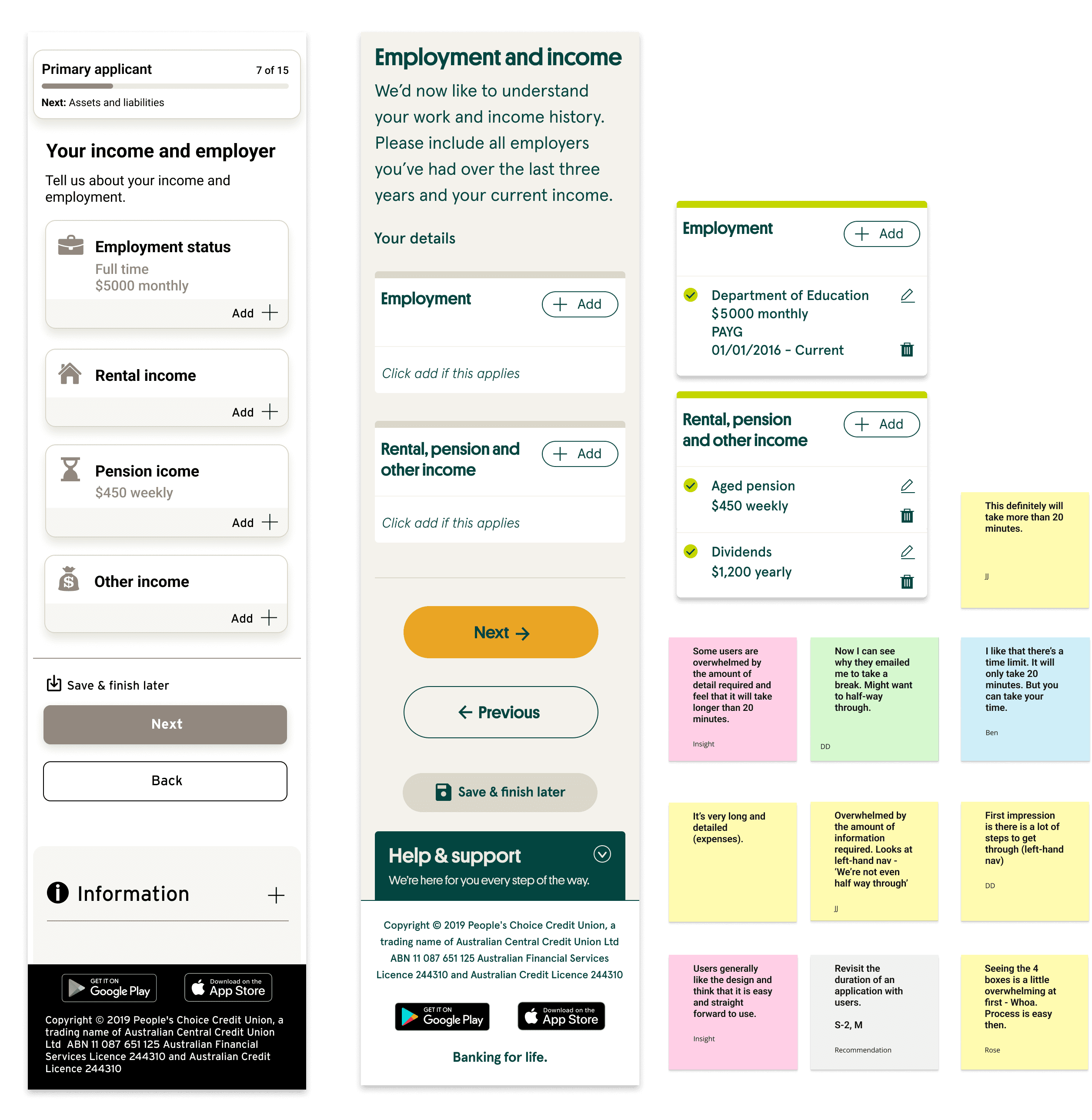
Concept testing
Two rounds of testing with 5 participants each (mix of face-to-face and remote)
Recruitment based on research guided recruitment
We measured ease of use, ability to save/resume applications, document upload clarity, and expectations for communications/updates
Mixed methods: qualitative sessions + analytics (Google Analytics, heatmaps
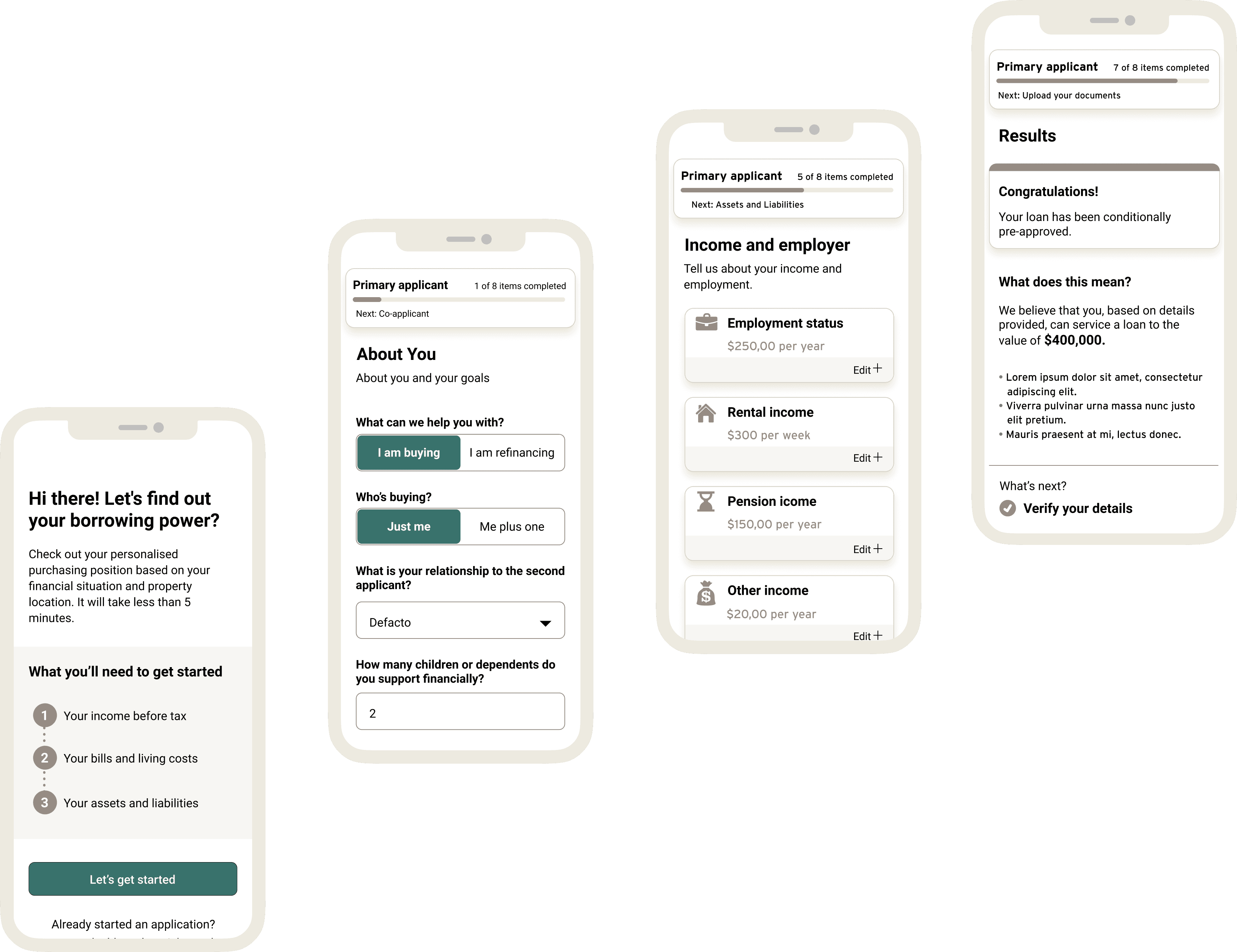
Iteration
After testing, we applied MoSCoW prioritisation to improvements and iterated across the full interface. Key changes included:
Clearer CTAs: Users didn’t understand “Go to your applications”; replaced with more intuitive wording (“Let’s get started”).
Context for data collection: Users questioned why certain information was required; we added tooltips, inline help, and better flow placement to reduce friction.
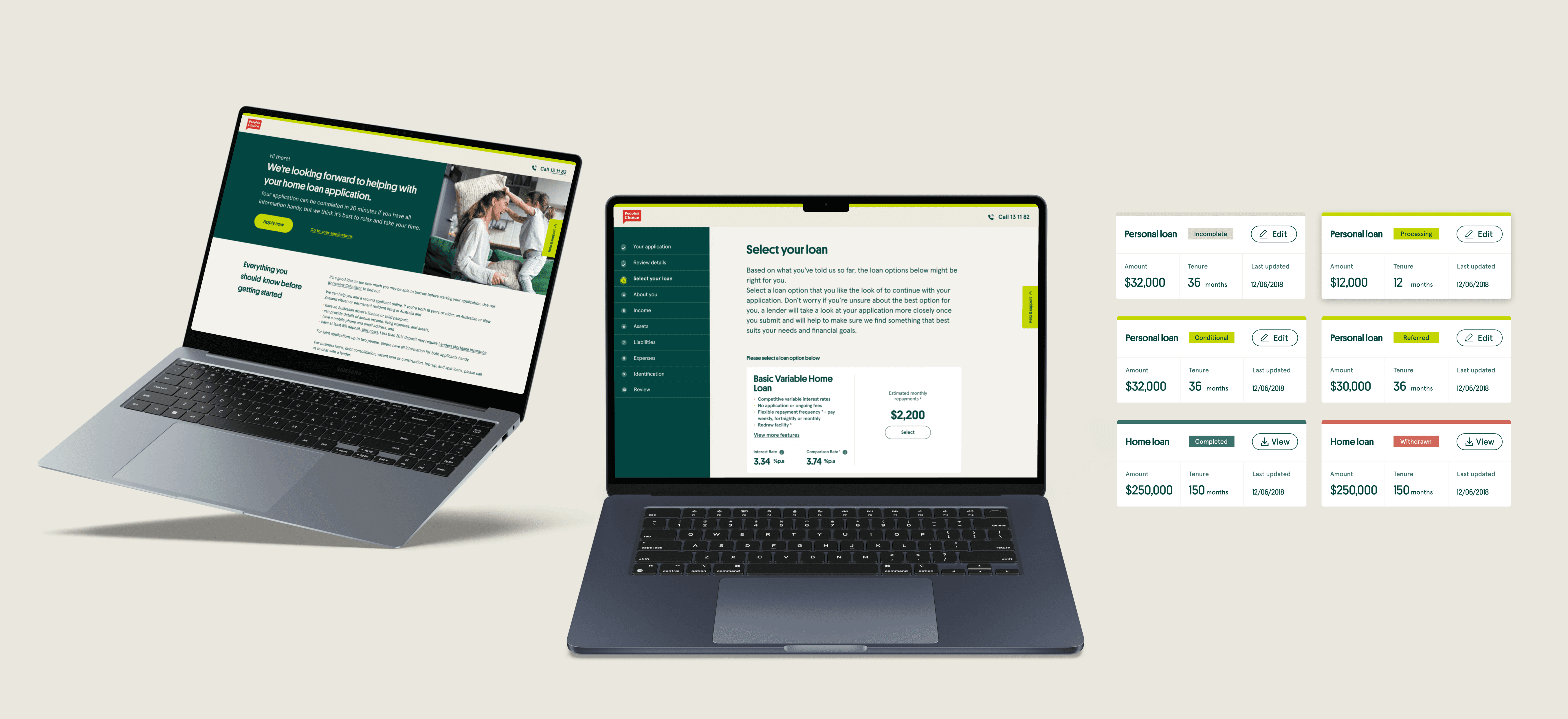
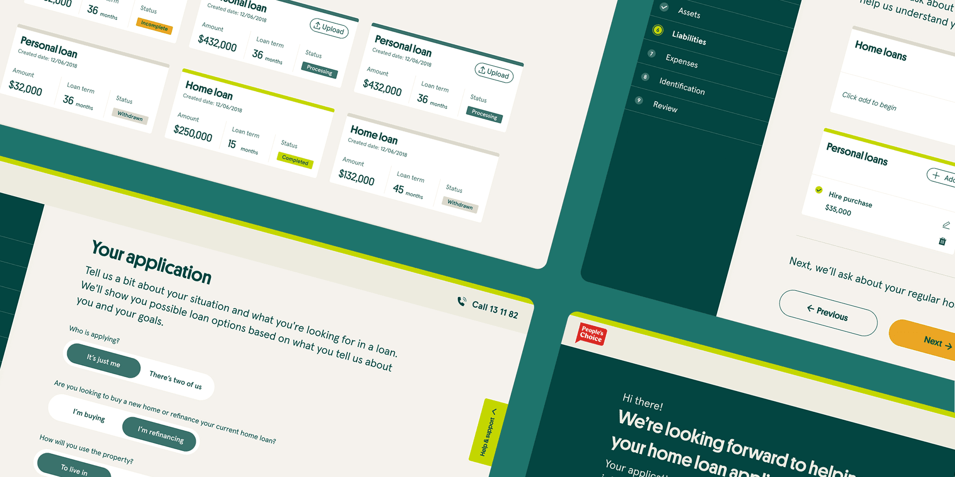


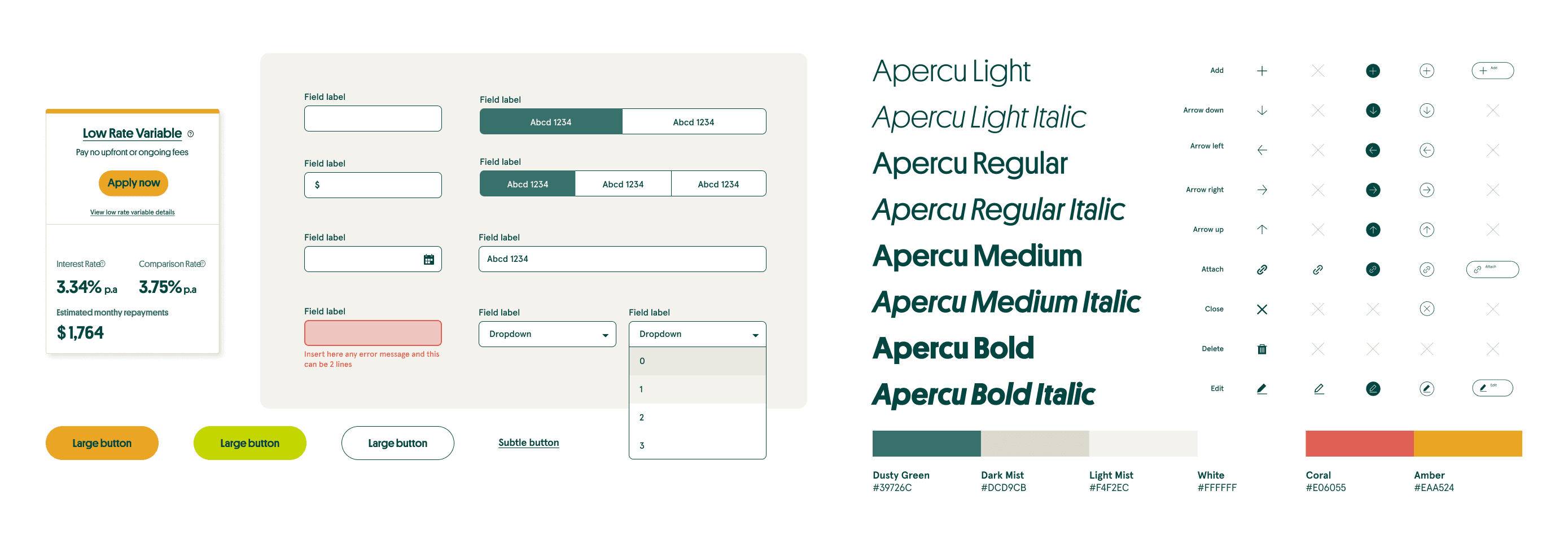
Design system
We built a design system alongside the new loan platform to keep everything consistent and scalable.
Reusable components for forms, navigation, and document upload
Clear style guidelines with colours, typography, and spacing
Design tokens shared with engineers for easy updates
Common patterns like progress indicators and error handling
Accessibility baked into every component