People’s Choice Credit Union — UX Design, Research & Testing
Role
UX Designer
Company
People's Choice
Type
Research, UX, UI, Product management,
Impact
Led a payments experience that boosted revenue by up to 30%
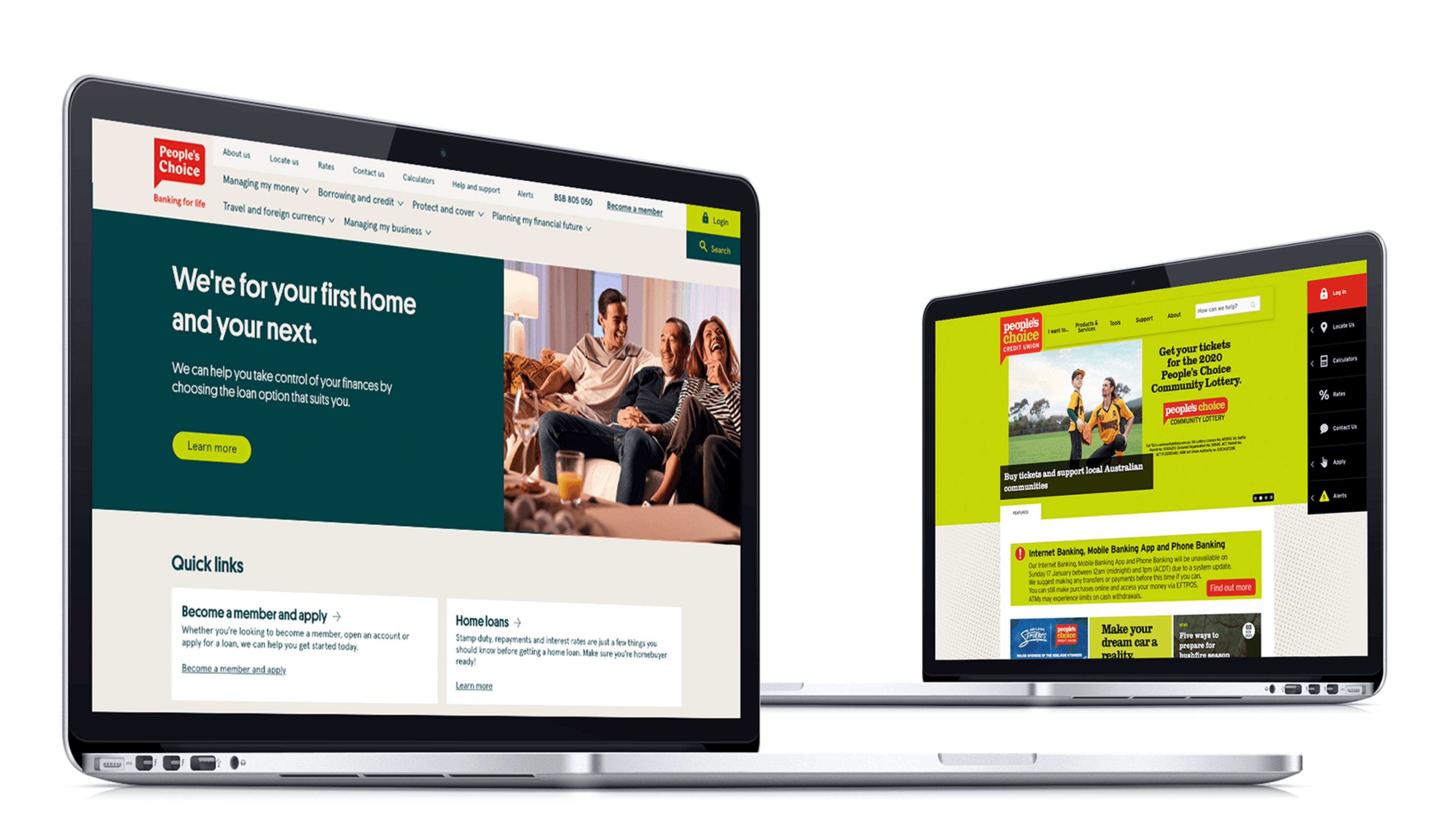
When I joined the project, People’s Choice was in the middle of a big digital transformation. Their back-office were moving to Salesforce, rebranding, and trying to modernise every part of their experience. The public website was still sitting on a ten-year-old system and didn’t reflect where the organisation was heading.
Challenge
The old site was cluttered, full of jargon, and hard to use on mobile. Teams had added things over time, so it felt disjointed. Our goal was simple: make it easy for people to find what they need quickly while supporting the new brand, accessibility, and content system.
My role
I joined as the UX designer working with the Member Experience team and collaborating heavily with marketing. I led the user research, information architecture, prototyping, and usability testing. My focus was to make the experience simple, clear, and built around what members actually needed, not what the organisation wanted to promote.
✔️ Research (Qual) | ✔️ User Interface | ✔️ Prototyping | ✔️ Product Strategy
Research & discovery
We started by talking to teams across the business to understand what members struggled with and where the website was falling short.
Stakeholder workshops
5 sessions with marketing, lending, and support
Mapped business goals and success measures
Identified early friction in content governance and IA
🧠 Actionable insights
Teams were aligned on growth goals but had competing content priorities
Needed a single view of the member journey to align language and goals
Conflicting naming conventions created confusion in navigation
Needed a single view of the member journey to align language and goals
Member workshops
3 sessions in Adelaide and Melbourne
ix of new and long-term members, ages 25–65
Tasks focused on finding loan rates, calculators, and support info
🧠 Actionable insights
Members searched by goal (“buying a home,” “saving money”) not by product
Content tone felt impersonal and overly formal
Loan calculators were the first step in most journeys
Members expected to see quick comparisons and clearer next steps
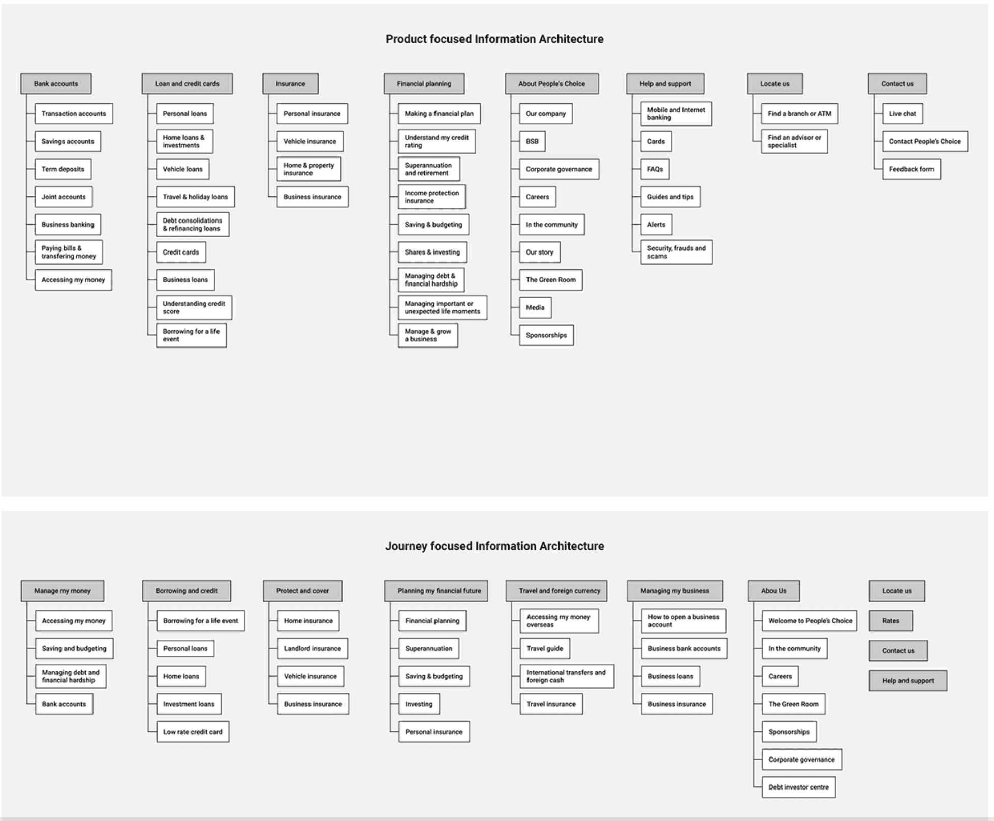
IA testing (Treejack)
Compared product-based vs journey-based structures
Product-based IA — organised around traditional banking categories like “Loans,” “Accounts,” “Insurance.”
Journey-based IA — organised around real member goals such as “My Home,” “My Everyday Banking,” and “My Future.”
25 participants including staff, members, and non-members
Used quantitative Treejack data plus qualitative follow-ups
📊 Results
Journey IA: 78% task success
Participants described journey labels as “more natural” and “human”
Product IA: 63% task success
Suggested adding shortcuts for tools like calculators and rates
Design & testing
We took the research findings into wireframes and interactive prototypes across desktop and mobile.
Usability testing
Two rounds with members and internal staff
Round 1 focused on navigation and hierarchy
Round 2 tested key tasks like finding rates and using calculators
Prototypes were kept low-fidelity to focus on structure, not visuals
🧠 Actionable insights
Secondary menus were overwhelming and repetitive
Some terminology confused non-members (“offset,” “variable”)
Rates and calculators were too hidden in navigation
Plain-language labels improved task confidence and success rates
📊 Iteration results
Task success improved from 68% to 85% after refinements
Drop-off rate reduced by about 30% on key pages
Navigation time shortened by roughly 25% across journeys
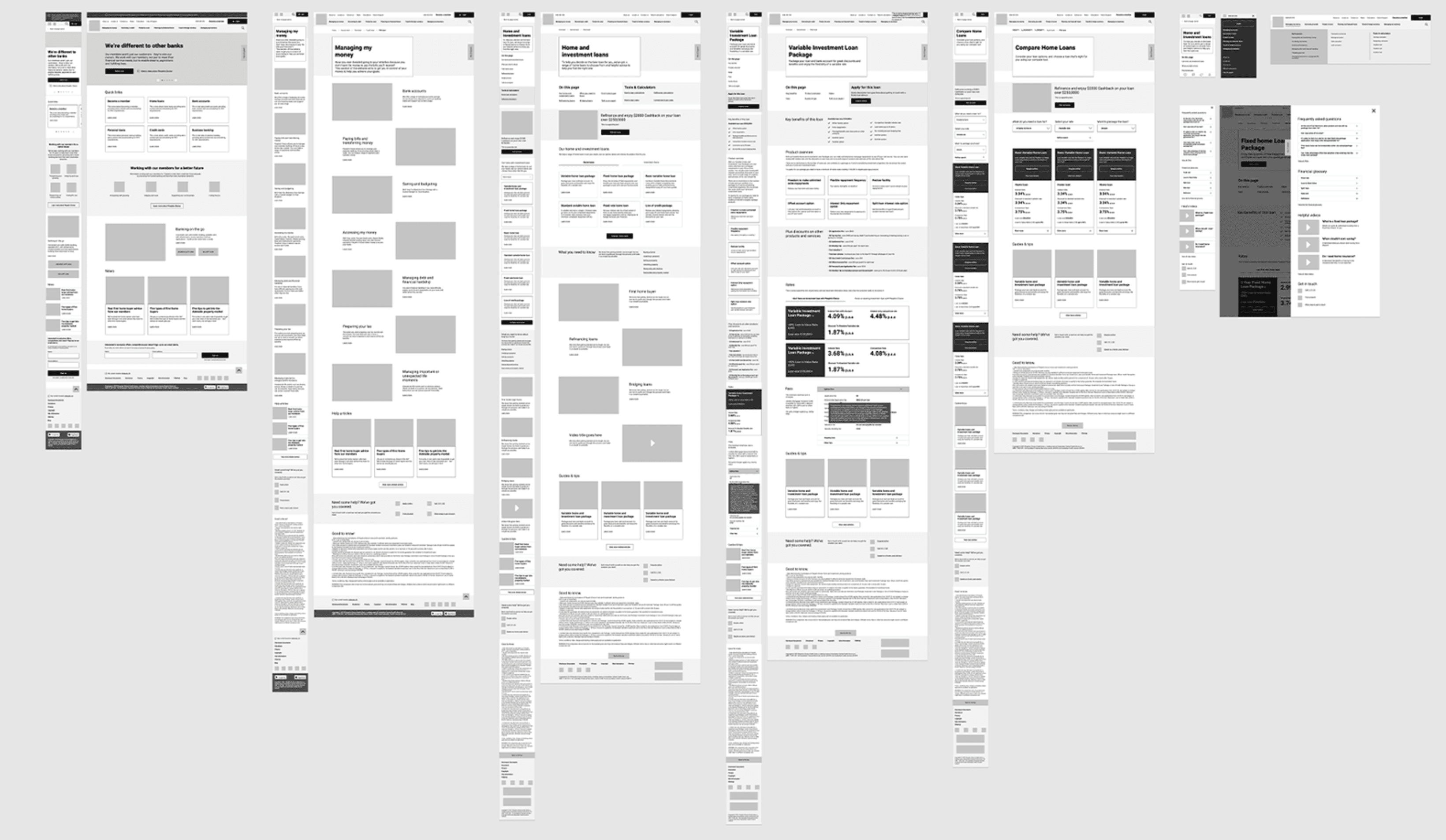
Design Refinment
Simplified navigation labels using real-world language
Elevated calculators and key tools in the hierarchy
Introduced global search and clearer CTAs for high-intent tasks
Created flexible templates that scaled across product lines
🧠 Actionable insights
Members valued clear next steps over marketing copy
Accessibility reviews highlighted colour contrast and touch targets
Consistent structure improved confidence across devices
Iterative testing helped align design, marketing, and tech decisions
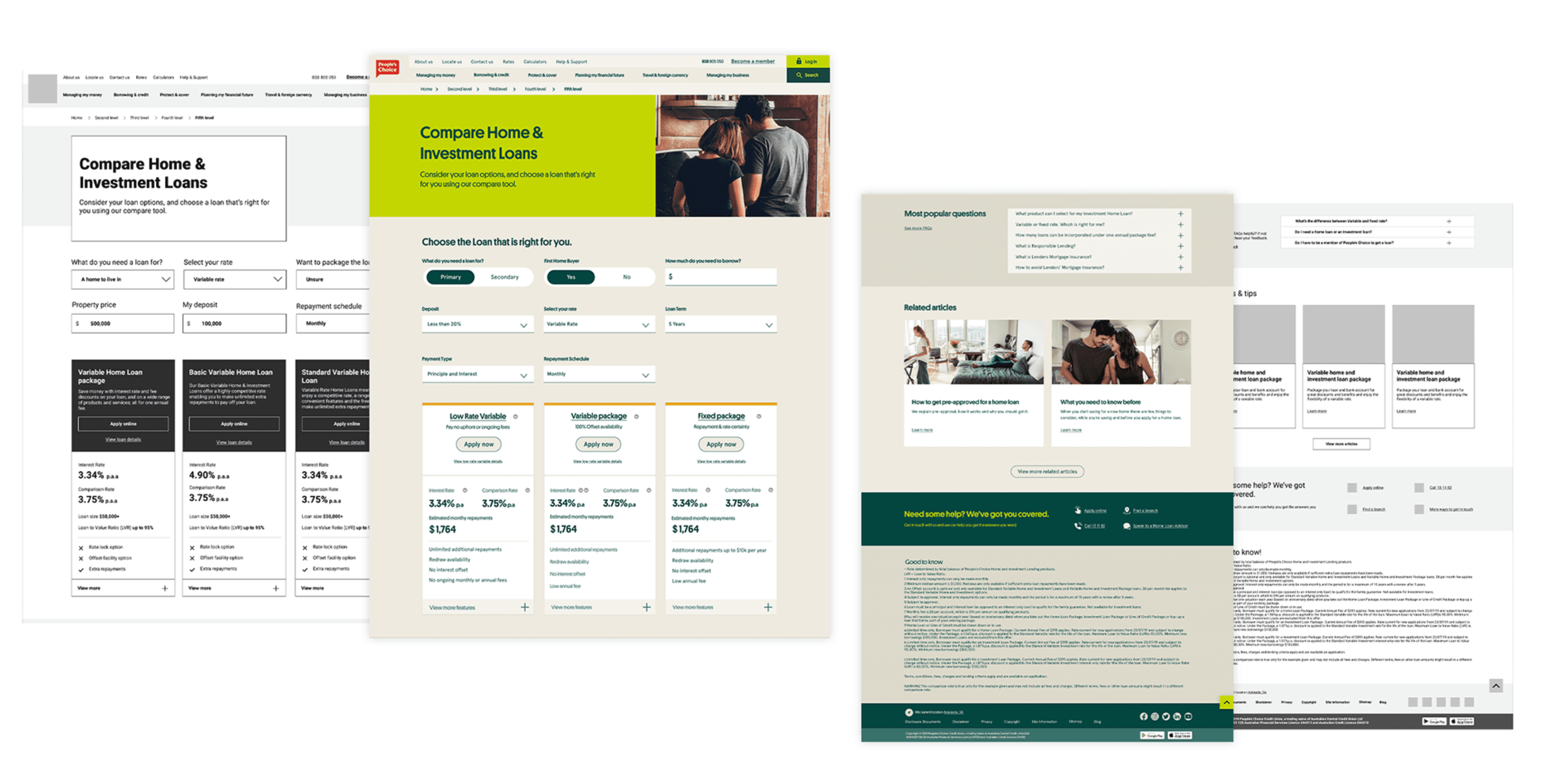
Outcome
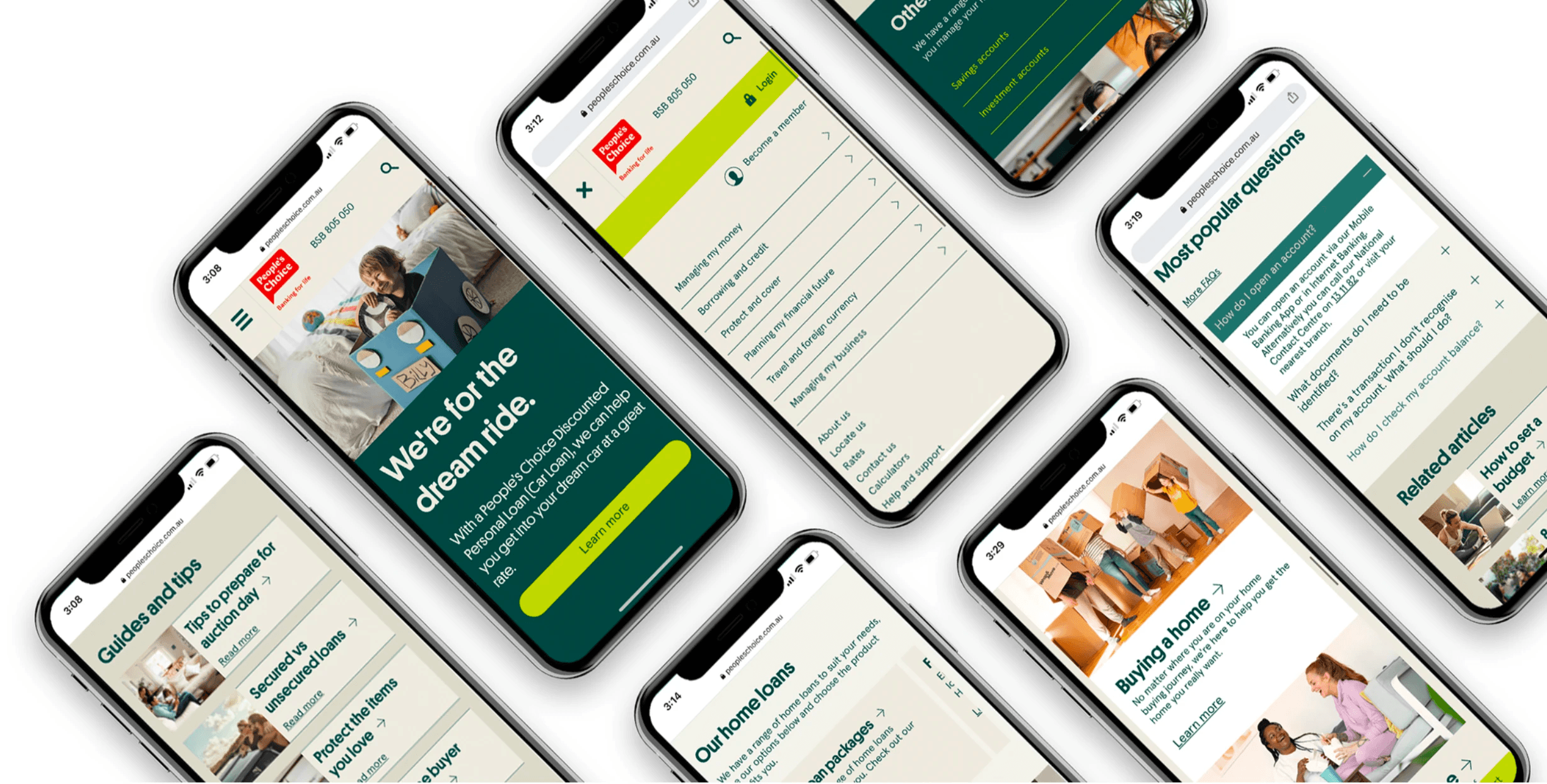
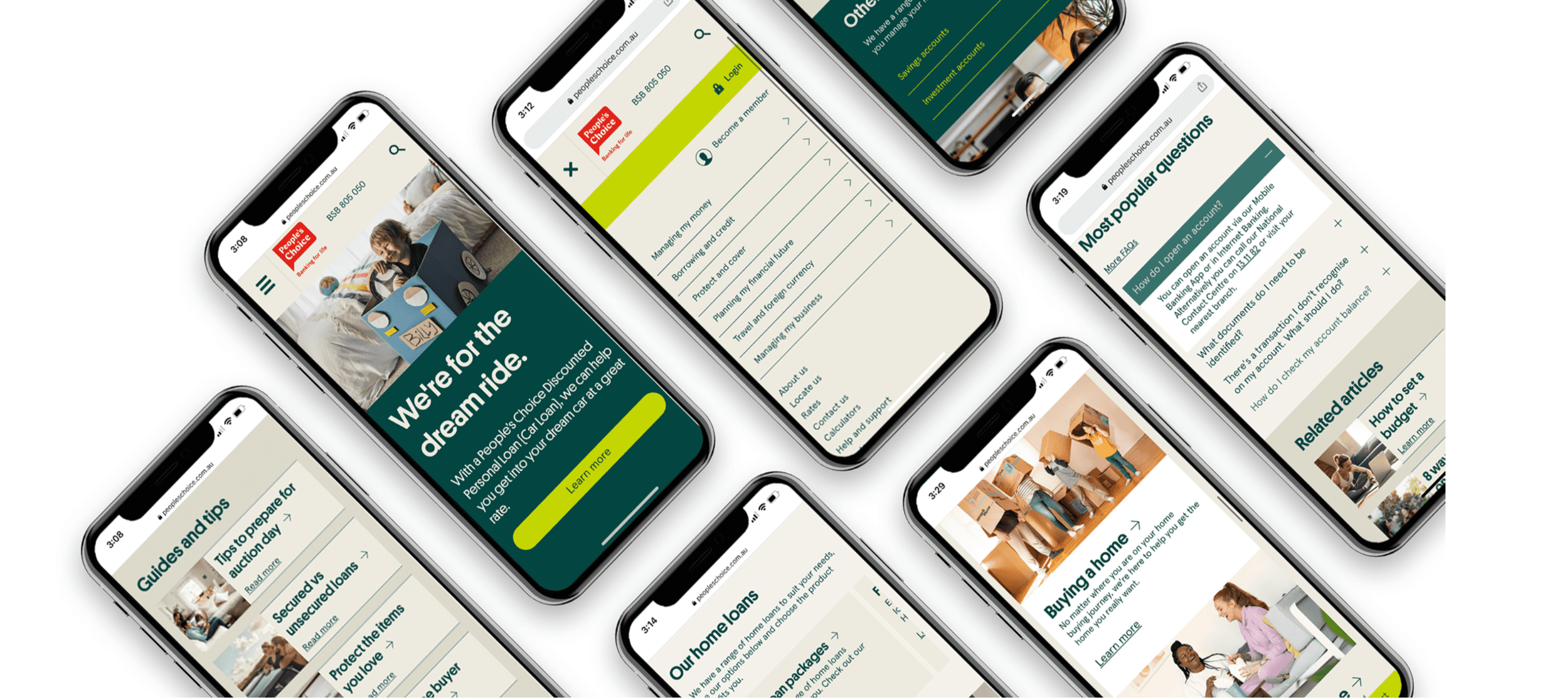
The new site launched in 2021. It’s fully responsive, easier to navigate, and designed around real member goals instead of internal structures.
📊 Results
Bounce rate down 22 %
Average session time up 30 %
Calculator usage roughly doubled
Mobile traffic grew from 38 % to 56 %
🧠 Key takeaways
Journey-based IA reduced friction and improved discoverability
Testing turned subjective debates into data-driven decisions
Internal teams could now manage content directly through the CMS
The new design built trust and consistency across digital channels