People's Choice
Overview
People's Choice was advertising a digital account opening experience. The reality required a branch visit to finish. 87% of prospective members dropped out before they could become members.
Position
UX Designer
Scope
Research · UI design · Prototyping
Scope
Product designer and PM
Markets
Australia
Impact summary
Increased payment plan conversion by 83% after rebuilding the payment flow
Cut account opening time from up to 5 days down to under 5 minutes
87% of applicants were abandoning at the ID verification step before the redesign
Hypothesis to beat: less than 50% drop-off. Final result: 41%. Target exceeded.

My role
UX designer, end to end
I was involved across the full engagement: discovery workshops, qualitative research, competitor analysis, prototyping, usability testing, and implementing the feedback loop through to delivery. I also supported the UX team across stakeholder engagement to ensure business requirements shaped the design, not the other way around.
The problem
87% dropped out before they became members
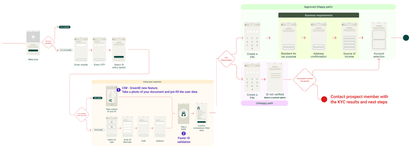
People's Choice advertised account opening as a digital experience. What it didn't mention was that members still had to visit a physical branch to complete ID verification. Prospective members started the process expecting to finish it online, hit a wall, and left.
The brief
The business goal was clear: remove the branch requirement entirely. Account opening should take less than five minutes, fully online, with no handoff to staff.
Research
Six interviews. Three things everyone said.
We ran six qualitative interviews alongside a competitor analysis to understand where the current onboarding failed and what members expected from a digital-first bank. The funnel told us where people left. The interviews told us why.
"The onboarding process was painful and slow. It took a day for someone to call me."
Lending staff member
"I don't understand why you need all of this personal information."
Home loan applicant
The key insight
The drop-off was not primarily a usability problem. It was a trust problem. Members were being asked to share sensitive information and verify their identity without being told why, how it would be used, or what happened next. Fixing the flow without fixing the trust gap would not move the number.
Design decisions
Two problems. Two direct responses.
01
Remove the branch visit with a photo ID KYC flow
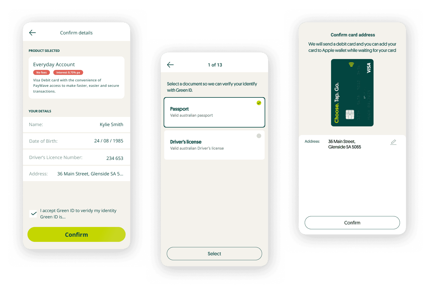
The branch requirement was the single biggest drop-off point. We replaced it with a new KYC step: members snap a photo of their ID, the system verifies it and pulls key details automatically. The entire process happens in the app, in under a minute. No branch, no wait, no callback.
02
Explain why we need each piece of information
Research showed members weren't refusing to share data — they were refusing to share it without context. We added inline explanations, tooltips, and reordered the information sequence to match the mental model of someone opening an account for the first time. Trust went up. Drop-off went down.

Outcome
Drop-off halved. Target exceeded.
The hypothesis going in was a reduction to below 50% drop-off. The result came in at 41%. Account opening went from up to five days to under five minutes.
41%
Drop-off rate, down from 83%
<5 min
Account opening, down from 5 days
What I'd do differently
Two things I would change
01
Test the privacy messaging before the prototype, not during it
The concern about selfies and data use came through clearly in usability testing. It should have come through in discovery. A single concept question in the initial interviews would have surfaced it earlier and given us more time to get the messaging right before we built anything.
02
Measure what happened after sign-up, not just at sign-up
We optimised for completion rate. A stronger outcome would have included post-onboarding activation: did members who signed up digitally actually use the account? Whether the new members were genuinely engaged or just lower-friction to acquire would have changed how we prioritised the next iteration.