People's Choice
Overview
Redesigning the end-to-end home loan experience for one of Australia's largest credit unions, from the first application step to final approval.
Position
UX Designer
Scope
Research · UI design · Prototyping
Markets
Australia
Focus
End-to-end loan lifecycle: staff workflow, member experience, and cross-channel continuity.
Approach
Research, service design, and UI. Two rounds of usability testing across the full flow.
Outcome
Improved application completion rates and a design system built to scale across the platform.


Context
A credit union built on trust, held back by its own systems
People's Choice is one of Australia's largest credit unions. Home loans are their primary product, and the loan origination process had become a liability: multiple disconnected systems, manual re-entry of data at every handoff, and no continuity between channels.
Digital transformation was the trigger. The real work was figuring out where the pain actually lived, for both staff and members.
The challenge
Two problems that fed each other
Slow staff workflows created delays that frustrated members. Frustrated members called in with questions that created more manual work for staff. The cycle was self-reinforcing.
The brief
Cut loan processing time through automation and system consolidation. Improve application completion by removing friction along the member journey. Design for staff and members at the same time, not as separate tracks.
My role
UX designer across the full cycle
I worked across the entire engagement, from discovery through to delivery, collaborating closely with product, engineering, QA, and marketing. I owned research, design, and testing, and supported developers through to launch.
Research
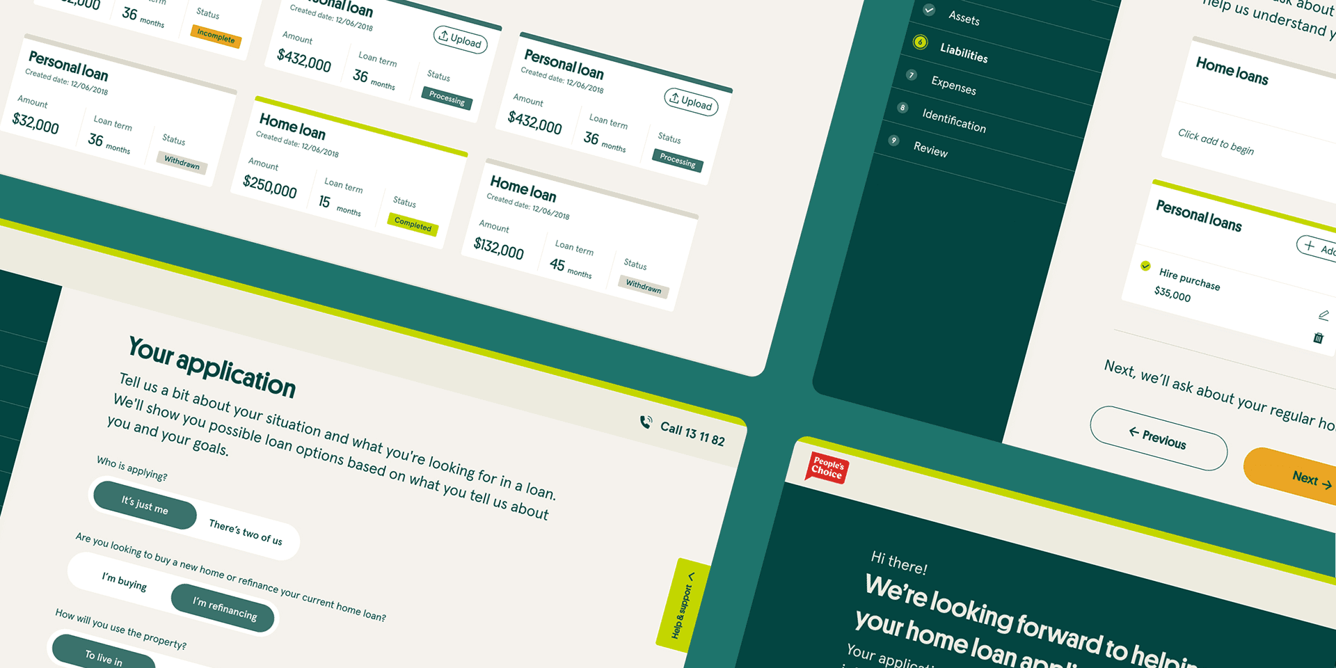
Mapping the real journey, not the assumed one
We ran workshops with staff and interviewed members across different stages of the loan process. Both groups pointed to problems, and they rarely pointed to the same moment. Five patterns came through clearly.
"I re-enter the same information three times before we can even look at an application."
Lending staff member
"I called to ask a question and they had no idea where I was up to. I had to start again."
Home loan applicant
The key insight
The loan process had been designed around the system, not the people using it. The disconnection between channels, the re-entry of data, the missing validations — all products of systems that had never been asked to talk to each other
Design exploration
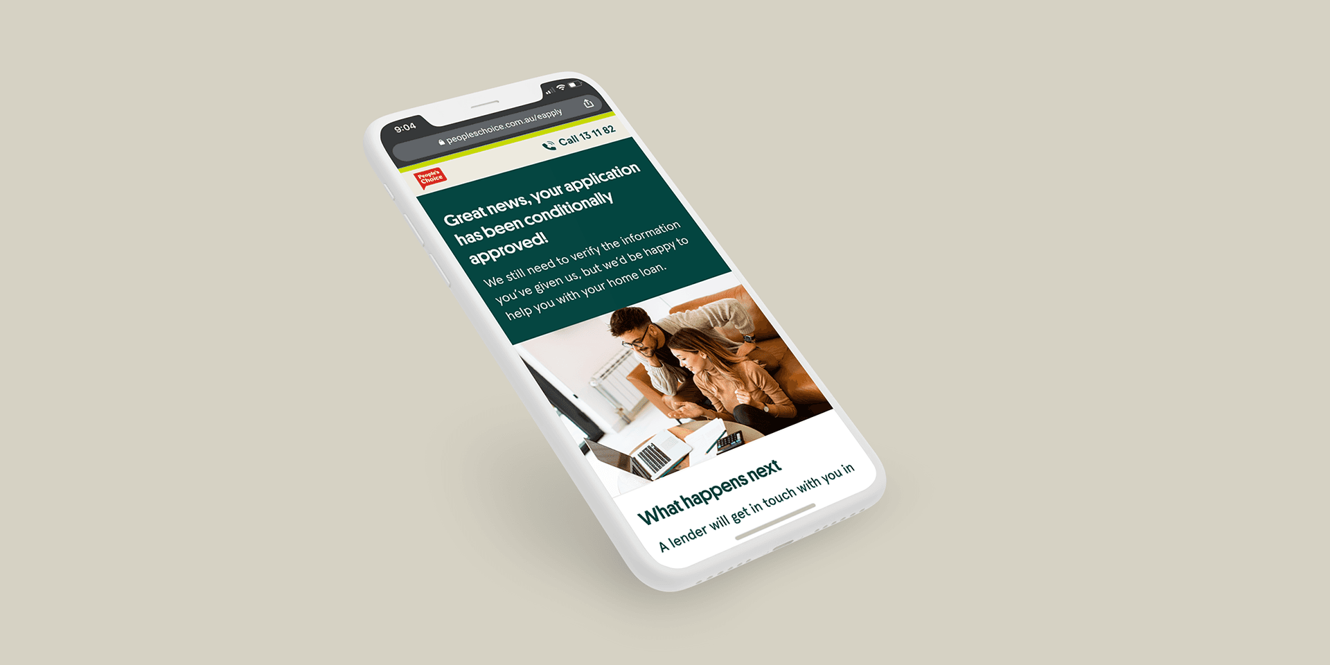
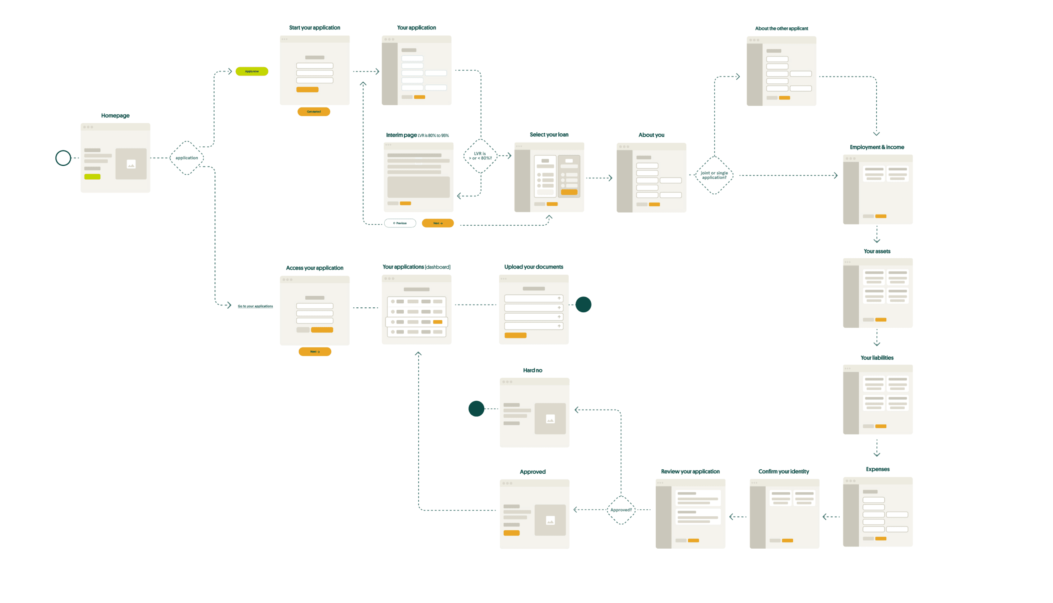
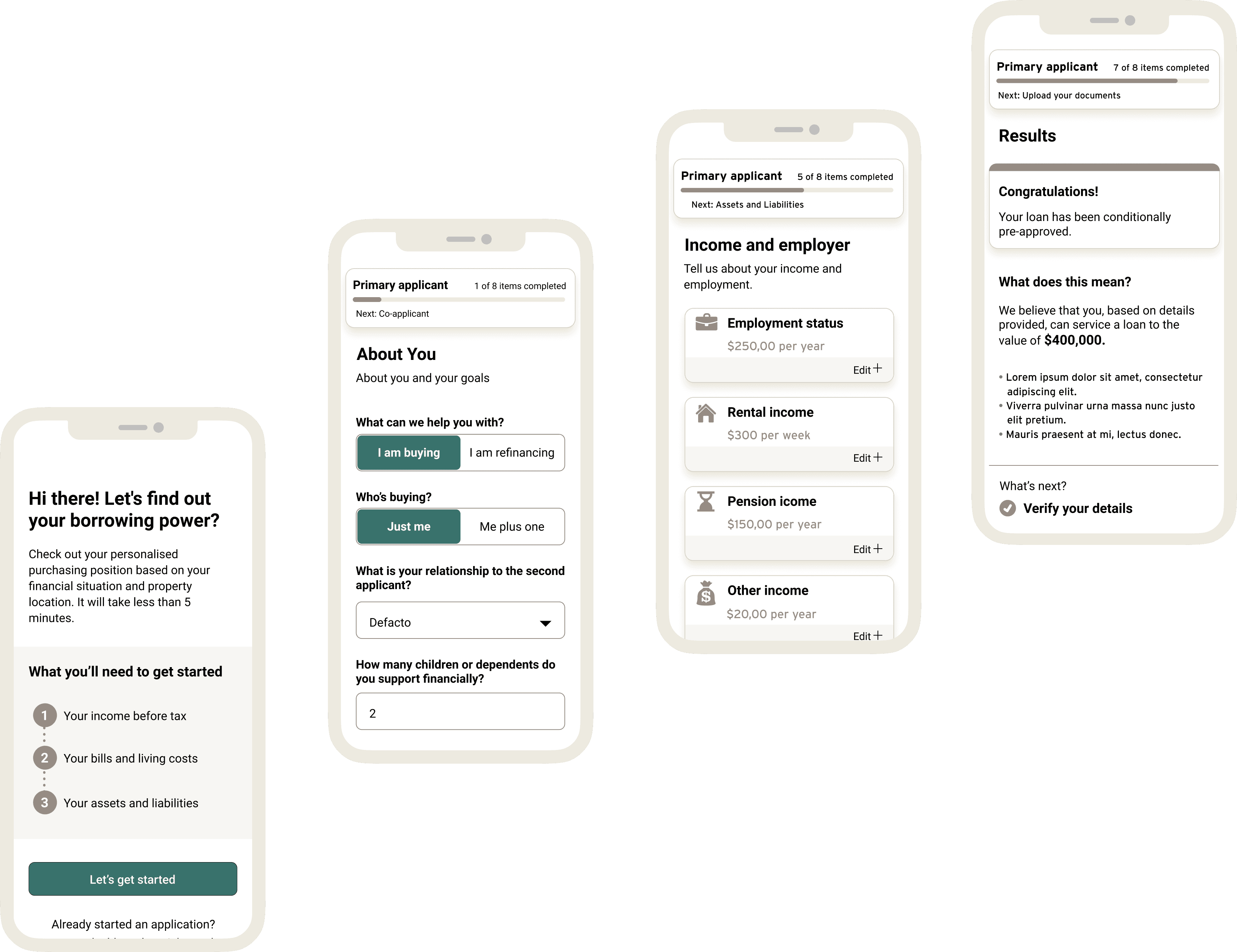
Tested twice, iterated throughout
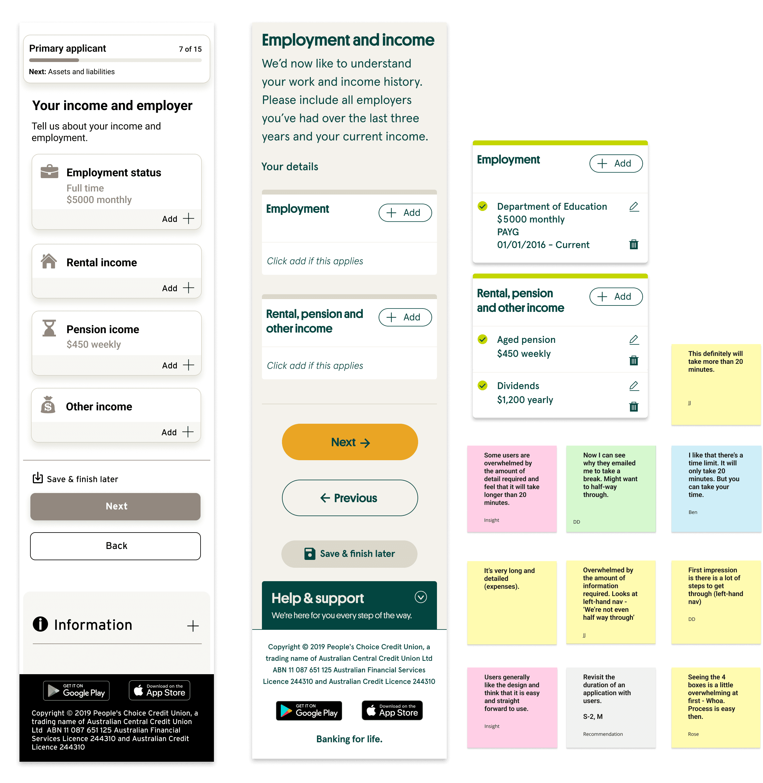
We started with wireframes on the verify flow and tested feasibility with vendors before moving to high-fidelity. Two rounds of concept testing, five participants each, face-to-face and remote. We measured ease of use, save-and-resume ability, document upload clarity, and communication expectations alongside Google Analytics and heatmap data from the existing flow.
01
Users didn't know what to do next at the most important moment
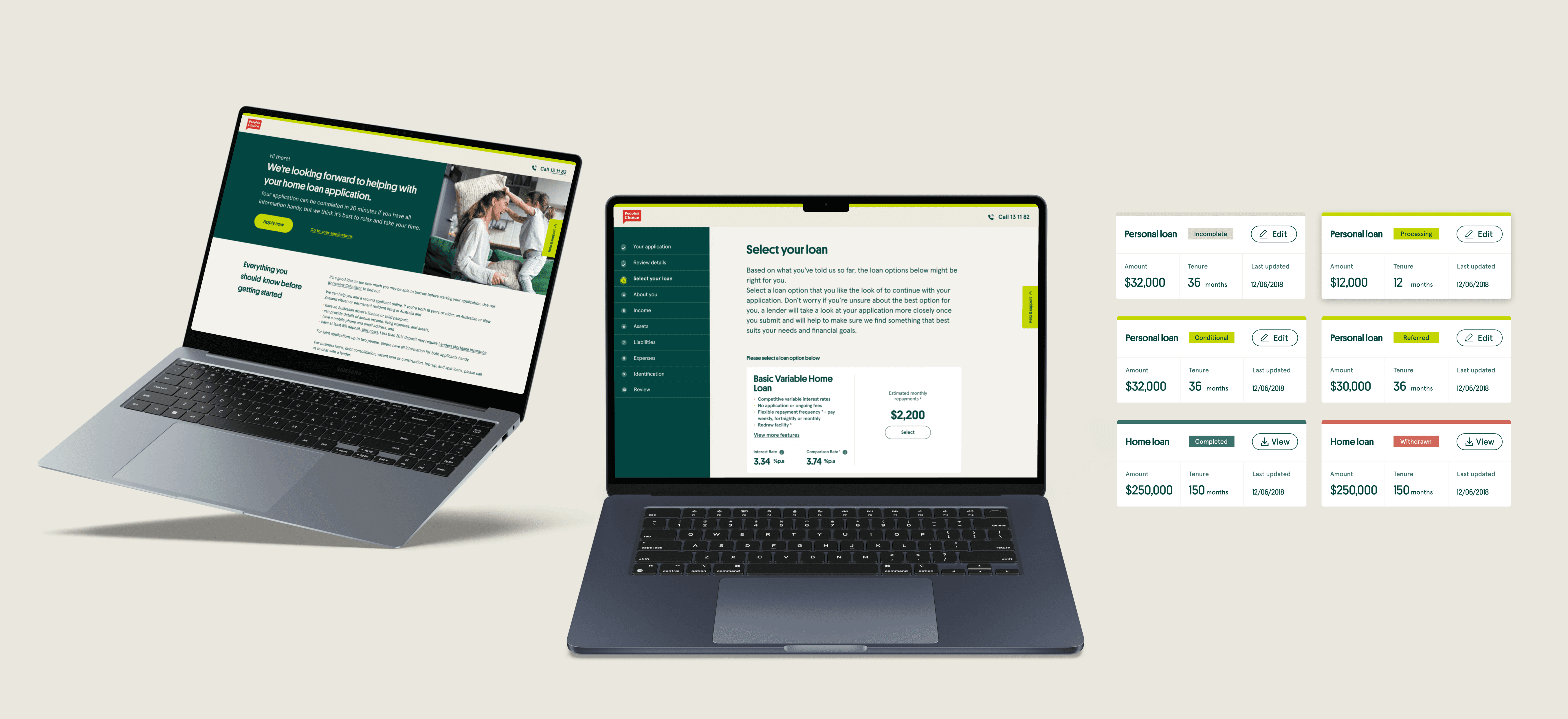
"Go to your applications" meant nothing to someone who hadn't completed one yet. We replaced every generic label with language matched to the member's actual state in the process. Small change, clear impact on confidence and completion.
02
Personal questions felt intrusive without context
Participants questioned why certain data was required at certain steps. We added inline help, tooltips, and reordered the information hierarchy to match the member's mental model. The flow stopped feeling like a form and started feeling like a conversation.
The system underneath
Built to scale beyond this project
We built a design system alongside the new loan platform. People's Choice had no shared component foundation before this. The intention was that what we built here would carry through to the rest of their digital products.
What we built
Reusable components for forms, navigation, and document upload. Progress indicators, error handling patterns, and accessibility baked in from the start.
How it was handed off
Design tokens shared directly with engineers. Style guidelines covering colour, typography, and spacing. A library the team could extend without coming back to design for every new screen.