Home loan made easy
Enhanced home loan digital experience
Date
Client Name
People's Choice
Services
Research
Customer Experience
User interface
Overview
People’s Choice is one of Australia’s largest credit unions, known for low-rate home loans. But behind the scenes, their lending operations were tangled in outdated systems, manual inputs, and disconnected processes.
To stay competitive and serve members better, they needed a shift—a fully digital, member-centric platform that would modernise the entire loan journey.
Challenges
The old loan system relied on too many tools, manual steps, and rekeyed data—slowing down approvals and frustrating staff.
Our challenge was two-fold:
Cut loan processing time through automation and system consolidation
Boost conversions by speeding up the path from application to approval
Research
We ran workshops with staff and interviewed members to unpack their experience—from initial application to final approval. This helped map the real journey, highlight bottlenecks, and design a smarter future state.
Key pain points we uncovered:
Clunky systems with poor integration, forcing staff to re-enter the same info
No way to use existing member data to personalise or fast-track applications
Errors in loan docs due to missing validation
Low application completion rates and slow turnaround
Disjointed channels: call centre staff couldn’t pick up where a member left off online
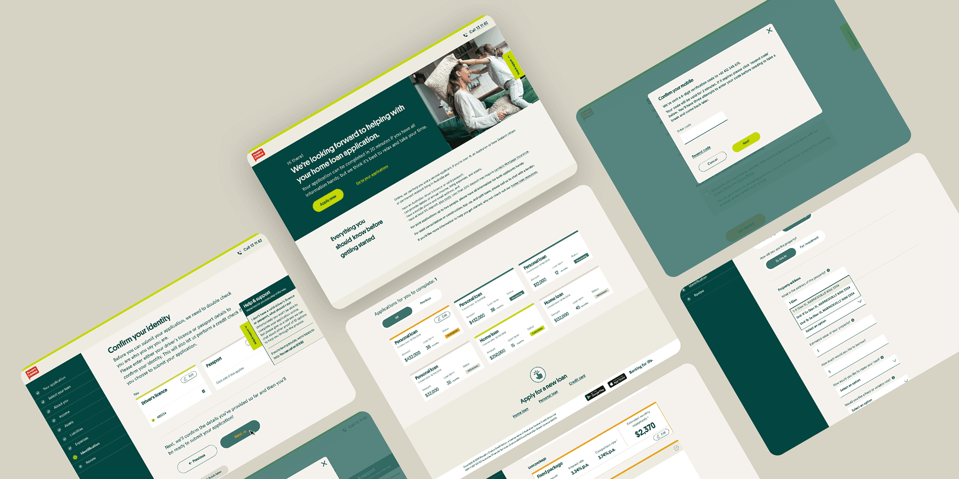
Design & Implementation
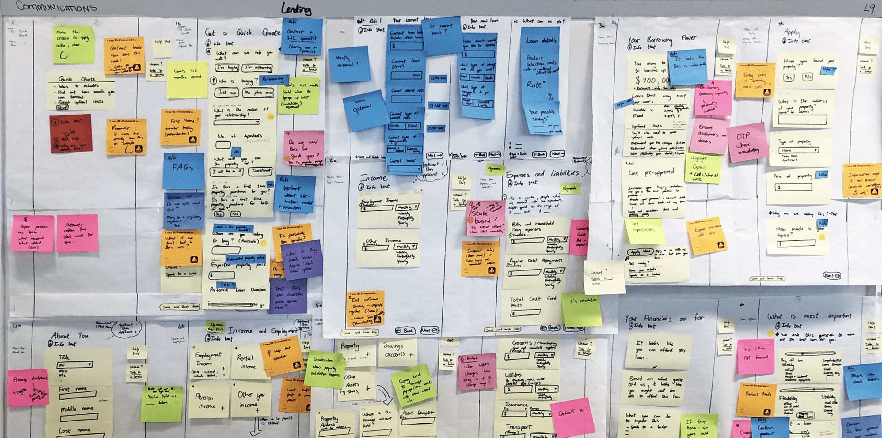
Wireframes
To prove out the new platform, we started with a few core screens focused on the “verify” flow. I created wireframes with just enough interface detail to show intent, align with stakeholders, and stress-test feasibility with development partners.
This quick, low-fidelity phase helped us spot issues early and refine the concept before investing in high-fidelity design.
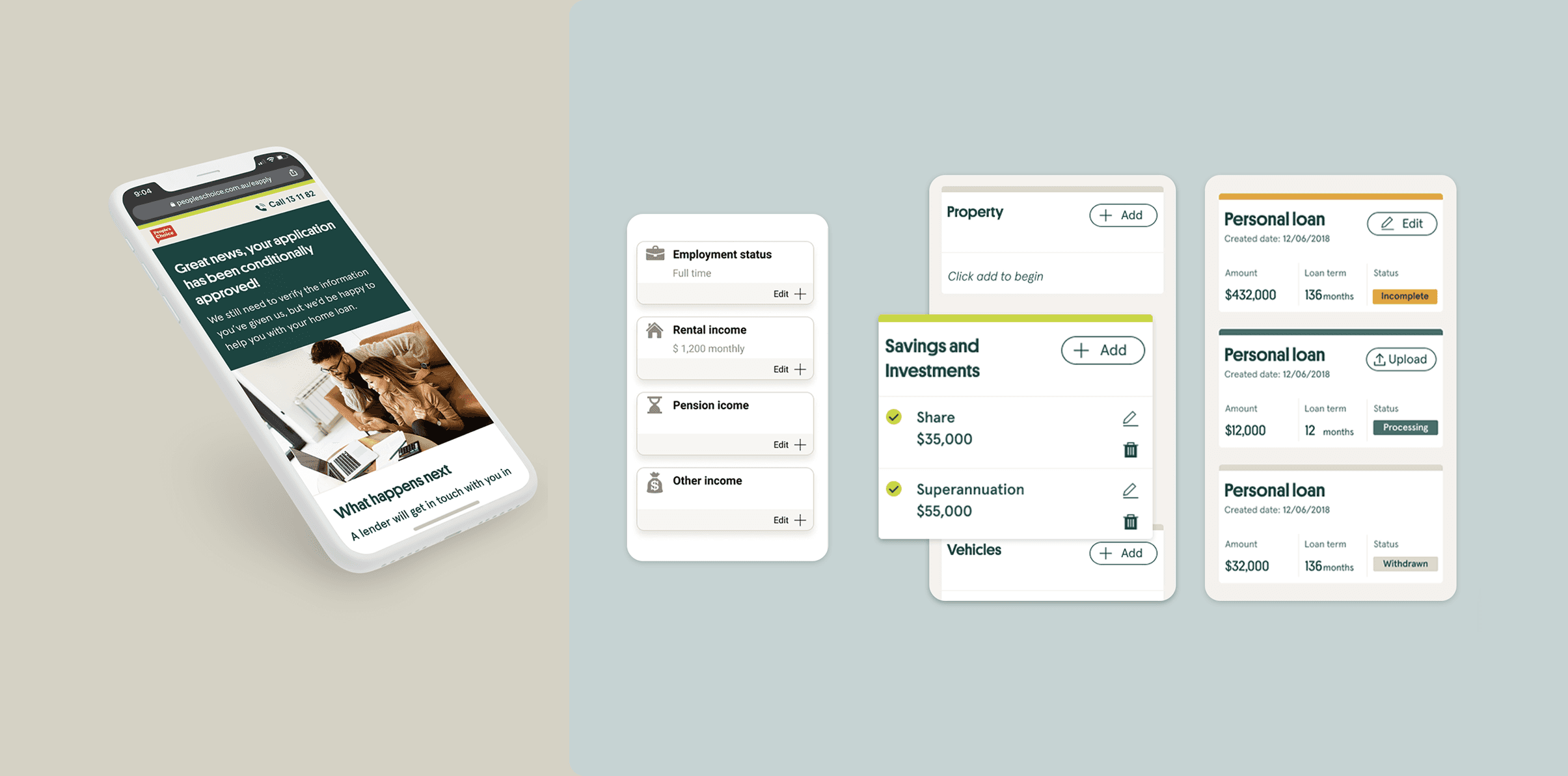
Usability Sessions
We put the prototype in front of users that matched our key personas, real people navigating real borrowing scenarios. Over two rounds of one-on-one testing (a mix of in-person and remote), we looked for friction and moments of clarity.
We tested:
How easily people could move through the loan flow and ask for help
Whether they understood when and how their progress was saved
How they felt about uploading docs and connecting bank statements
When they expected updates, and how they wanted to receive them
We backed up the qualitative findings with analytics and heatmaps, getting both the “why” and the “what.” That mix gave us a fuller picture and helped us fine-tune key touchpoints in the journey.\
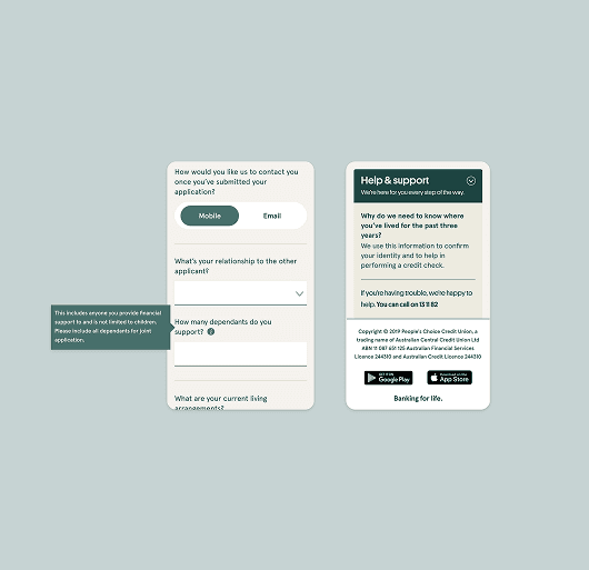
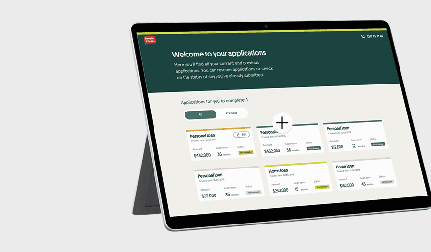
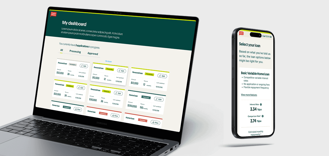
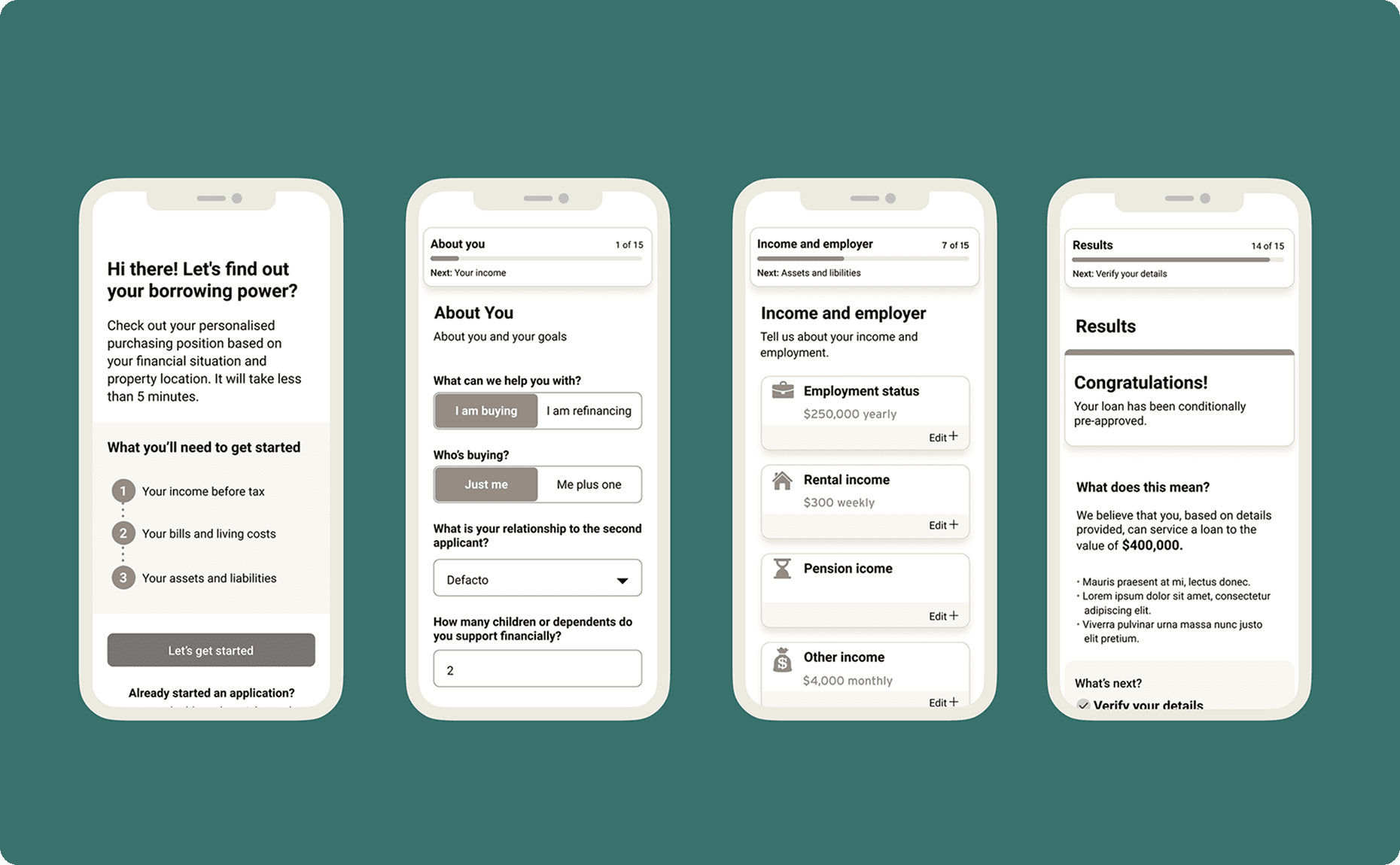
Iteration
With core flows validated, we prioritised improvements using research insights. After updates, we designed the full interface and detailed the interactions. Six months later, a second round of testing helped spot remaining issues.
Clearer calls to action
“Go to your applications” was confusing. Some users missed it, others misunderstood it. We replaced it with clearer language that matched what users expected after clicking “Apply online.”
Better context for personal questions
Users often asked “Why do you need this?” or “What does this mean?” We rewrote unclear content, added tooltips, and shifted some questions to more logical points in the flow.
The outcome
What started as a system upgrade became a full experience rethink. The result was a cleaner, faster, more intuitive lending platform.